Making a osCommerce template: all the progress step by step
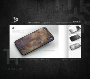
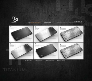
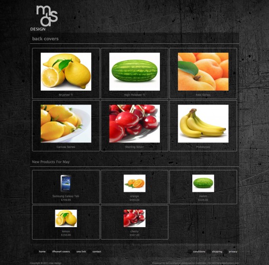
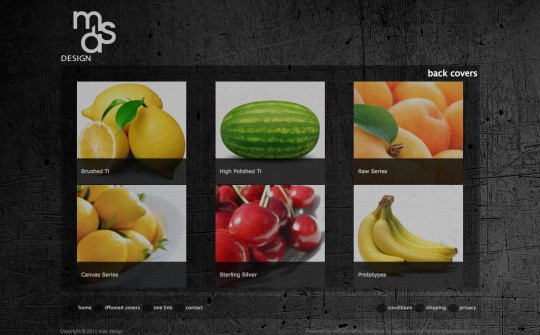
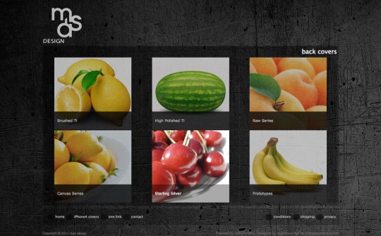
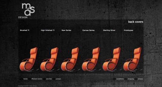
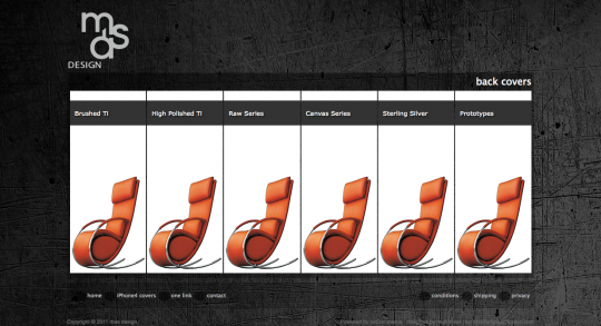
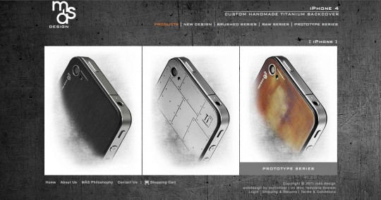
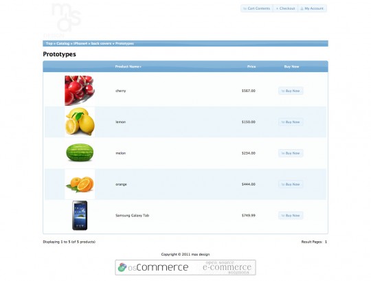
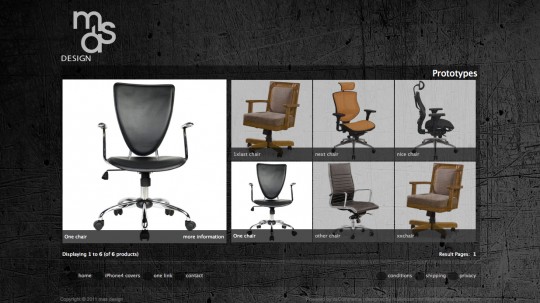
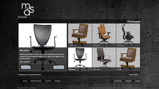
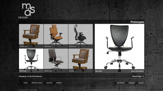
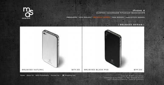
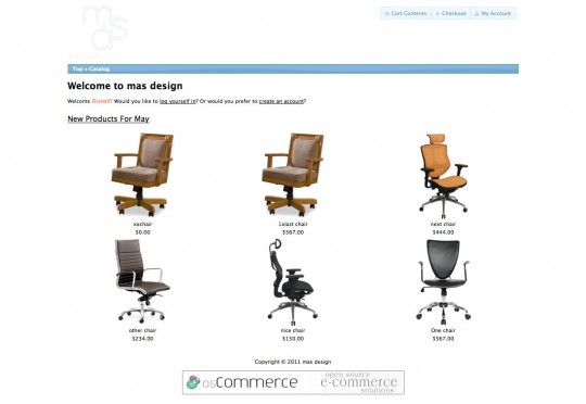
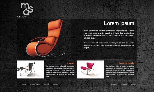
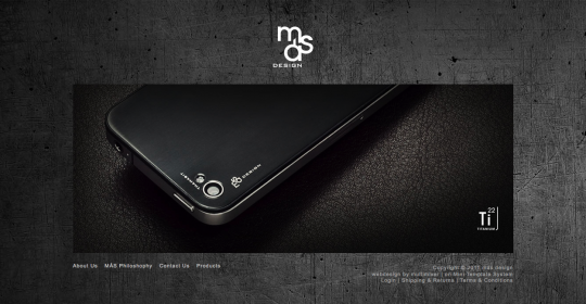
multimixer | work | Monday May 16 2011I got a request to create a new osCommerce store. Very happy about this of course, new projects are always welcome, but more important, I liked the initial design idea, and that’s a great motivation always. Here are some of the images I got about how the website should look like
It is a great help to get a concrete information about the clients vision on how the website should look like and even more to get a message like this one: “You have free license to do what you think works best and looks good. I believe in your artistic taste.”
Since this looks like a very promising project, the design is far away of whatever could be called a “stock osCommerce design”, I decided to post the progress of designing this new theme here. The post will be updated as I go, so if you like you can check back from time to time to see what I’m doing. Feel free to post any comments about anything.
The store is live and you can visit it if you like here Mas Design
Installing osCommerce
First step of course is to install osCommerce on my local computer using XAMPP. I’m going to use the latest production ready version, and hat is version 2.3.1 (version 3 is not ready to be used on live stores)
That is how the product information page look like by default (I’m going to start the design with this page). Columns have been removed, that is very easy to do in the administration panel under admin>modules>boxes. You can disable there any boxes you don’t want, if you disable them all, you will get a layout without any columns or boxes
I’m also going to use mini template system for the design. (please note that mini template system is a commercial addon for osCommerce, do not click the link if you are not interested in anything that is not free and keep on reading here)
The reasons to use mini template system for this are following:
- To have all design and template related files in one folder and not all over the osCommerce installation
- To be able to switch to an other template any time and for any reason, without having to modify any file
- To be able to use all the mini template system features to create the design easier, but most important
- To give the ability to my client to manage his template easily maknig any necessary adjustements him self without having to contact (and pay) me or anyone else for this
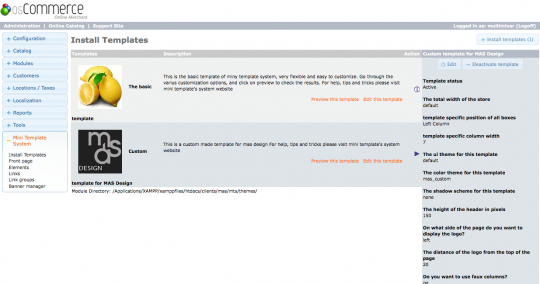
Having mini template system already installed on osCommerce, next step is to create a new template and activate it in the administation panel
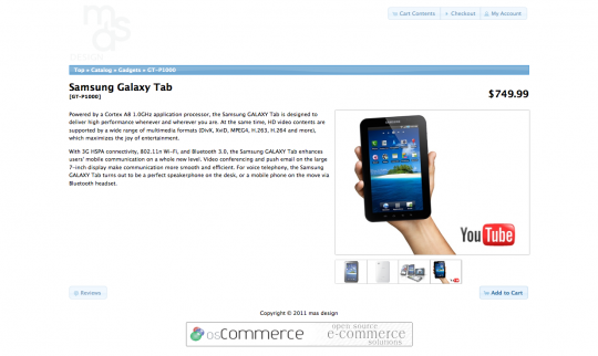
That is how the same product information page look like after installing the template.
On this base and within this template folder we will create the new template. Although I will use mini template system, following explanations will mainly point out what I would do if working on a default osCommerce store so that anyone interested can follow
Changing header and footer, adding background image
Header and foter affect the design the most. Changing them will give us immediately a new look and feeling and also, hopefully an inspiration on how to go on. To have the background image right away will give a feeling for all colors to be used
The background image can be added easily in the css file, this is in case of mini template system the file catalog/mts/themes/themplatefolder.style.css for default osCommerce it is catalog/stylesheet.css. We do add the background directly to the <body> as follows
body {background:url(images/backgroundPlain_2000x1718.jpg)}
There are of course many settings you can do here, depending on what type of background image you’re going to use (eg a large one as in this case here or a small one that you want to repeat etc) You can read more about at w3schools. It is important in any case to have the image uploaded on your server and to set the correct path to it, in this case it is in folder /images/ but it could be in any folder
In the header section only thing we do right now is to remove any menus, backgrounds etc and to leave just the logo in place. We will add a menu in a later step. The file to do this (in a default osCommerce set up) is catalog/includes/header.php, if using mini template system, you will find the file in catalog/includes/mts/themes/templatefolder/files.
In the footer section we can already do more. Since we don’t want a thick footer with many links and stuff in in, all we have to do is a simple <ul><li> structure, add the links we need to there (placeholder links for now) and style a little in the css file. The file to work on is called “footer.php” and is at the same location as the header file. As an example, the section of the footer that holds the left hand links, look like this in the file
        <ul class="left">
          <li><?php echo '<a href="'. tep_href_link(FILENAME_DEFAULT) .'"' . 'class="menu"' . '>'. 'home' .'</a>'; ?></li>
          <li><?php echo '<a href="'. tep_href_link(FILENAME_DEFAULT) .'"' . 'class="menu"' . '>'. 'one link' .'</a>'; ?></li>
          <li><?php echo '<a href="'. tep_href_link(FILENAME_DEFAULT) .'"' . 'class="menu"' . '>'. 'one link' .'</a>'; ?></li>
          <li><?php echo '<a href="'. tep_href_link(FILENAME_CONTACT_US).'"' . 'class="menu"' . '>'. 'contact' .'</a>'; ?></li>
        </ul>
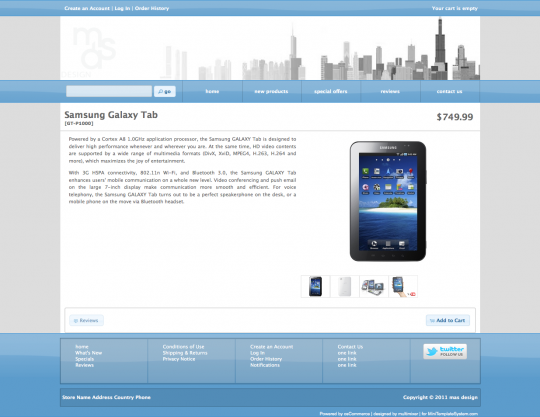
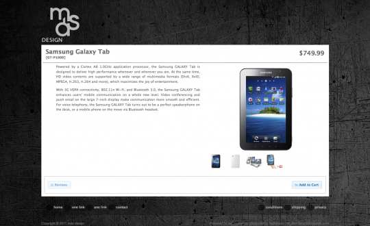
That is how the website look like after doing this changes
Already coming closer, not? Lets concentrate now on the contents and the layout of the product information page it self
Change the layout of the product information page
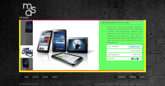
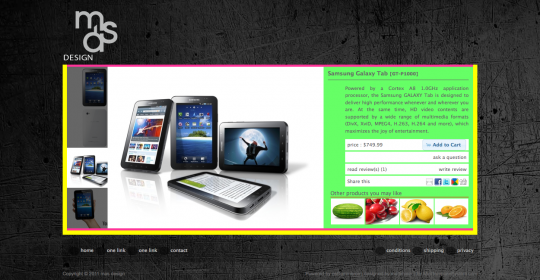
First we want to change the page structure, so we need to know how the various eements, like the image, description etc are placed. To visualize this, we just add stroong background colors to each “container”
 Now that we can see each area clearly, lets move the product images area to the left and the description to the right. This is easy to do, just open your file catalog/product_info.php, find following line (2 times in the code) and change the “right” to be “left”
<div id="piGal" style="float: right;">
It’s however recommended to not use inline styles but to add any rules to your css file.
We also move the <h1> area (holding the product name and price) and the button area to be on the right of the product image.
That is how it looks
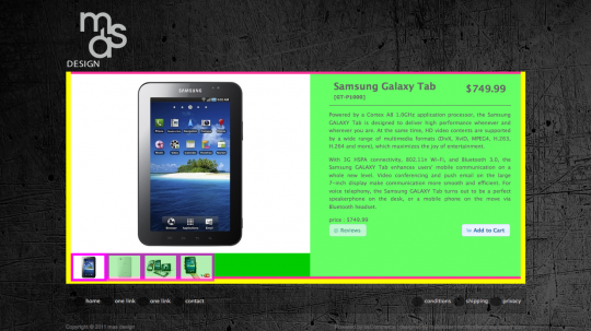 Next thing we want to do is, to move the additional images to be on the left of the main image and not under it. That’s also not hard to do, instructions are on the bx slider site, that is the script that osCommerce use to create the image gallery. Also important, to make the correct settings for the sizes of the main and additional images. They are done directly in file catalog/product_info.php, the default settings look like this, you need to change them according to the image sizes you plan to use
<script type="text/javascript">
$('#piGal ul').bxGallery({
  maxwidth: 300,
  maxheight: 200,
  thumbwidth: <?php echo (($pi_counter > 1) ? '65' : '0'); ?>,
  thumbcontainer: 300,
  load_image: 'ext/jquery/bxGallery/spinner.gif'
});
</script>
An other thing to do is to get the “social bookmarks” directly into the body of the product information page. I wrote a separate post about how to do this, please read here about how to move social bookmarks to the body product information page in oscommerce
I also reorganized the way the information is getting displayed like price, add to cart button etc. The add to cart button is still the default, this will change later after the general button style is decided.
Let’s check how things look now
Next thing will be to add “related products”, that is an area to show any cross- or up-sell items of a product. There is an addon existing for this in osCommerce, called “optional related products“. This need of course to be upgraded to work with version 2.3.1 of osCommerce. Also the way the product information get printed to the screen, need to be adjusted to the particular layout. An other layout, than the one shown here, is posted here and also used live on this site
However, in this case we need just the related product images to be dispayed, all other info will appear as a toltip upon hover, or in a “jquery dialog” upon click, I’m not sure yet. After adding this, the website look like this
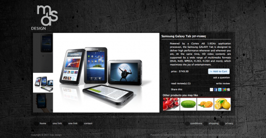
We are more or less done with the layout. Lets remove the help background colors and replace them by semi transparent rgba colors (for IE we will use png images) and that is how everything look like now
There are still more things to do of course, like to improve the page functionality: I don’t want the various links (like “ask a question about this product” or “reviews” etc) to lead to other pages, I don’t think that it is a good idea to let customers leave the product information page (except of course towards checkout), so all this information need to pop up within the product information page. For this I’m going to use either one of the existing scripts (the jQuery UI dialog or a fancybox style) or something totally different
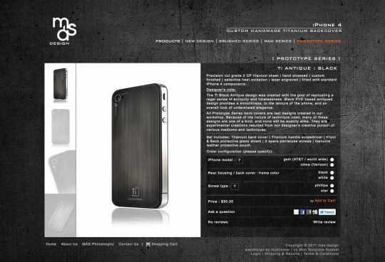
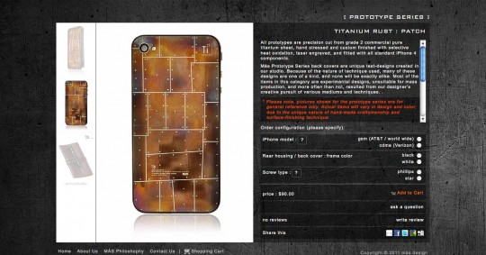
After doing some smaller changes, and after adding the real products and real images, here is how the product information page look like
What is new here, compared to the previous “version”?
Option types: That are the radio buttons that let users to select the iPhone model they use. For this I used the addon “option types v2” that I modified a little to work with osCommerce version 2.3.1. Additionally I added some more improvements made by me, like the ability to add short and long option descriptions etc. Unfortunately, I didn’t found time to upload a new version of the addon, all information is posted however at the osCommerce forum
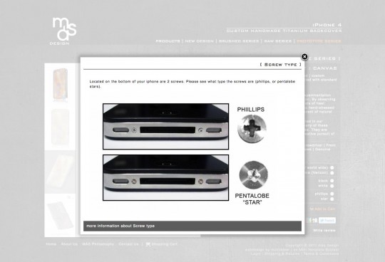
Here is an example of how the option description pop up window look like
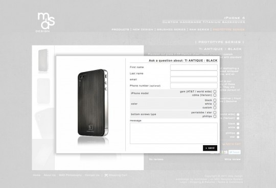
An other “new” thing is the “ask a question” feature, that enables store customers to send a question about that product to the store owner without having to leave the product information page. I think there are some addons available that promise to do this, I preferred however to create the functionality by my self from scratch.
I will make a separate post about this, for now just to say that what I did was, to create an ordinary form, same/similar to the contact us form of the default osCommerce, include it into file product_info.php, wrap it into a div and link to that div using fancybox, you can read more about at the fancybox usage instructions
Additionally I added the image of the product in question to the left and a jQuery valitadition. This is how the screen look like after pressing the “ask a question” link
An oer issue that had to be solved was the space issue. As you can see the text side of the product info page has the same height as the image side, so the text is limited by this. It appeared now the case, that some products needed some extra text, and there was absolutely no space for this.
One way was to add a scrollbar to the product description it self. This is technically easy, by adding an “overflow:auto” to the <div> that wraps the product description, but the result is really very ugly:
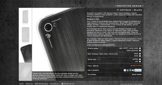
What to do then? Since the additional text is related to the images, why not to add it over the images and make it appear upon hover? This is what I decided to do, but how to implement? Not all products have this extra note, and the text can be different from product to product.
Someone would say to go on as follows: Make a new field in the database for the extra text, an input filed in admin to enter this text, then change the query in product_info.php to get this text, and finally modify the file one more time to display it. Such a trouble !
I did something totally different, using jQuery. Since we have it in osCommerce why not to use it? The particulat jQuery method to use is append() Using this, all I had to do is to type in the text into the product description, wrap my extra text into a <div>, give to that <div> an id, eg <div id=”kuku”> and then, using append() to move that <div> from its original place (the description) to the <ul> that holds the large image. To get the hover effect all you need is some css, there are many tutorials all over
Here is how it look like upon hover over the image:
Index pages: Product listing, category listing and home page
Next step is to do something about the homepage and the product and category listing pages. In osCommerce product listing and categories listing happens on the index page. This may be a little confusing, because usually we call “index” the “home” page. However, in osCommerce, the index page has 3 “cases”:
- case to list subcategories
- case to list products
- Case not to list anything, that case is if no “cPath” is given, that is the so called “front-” or “home-” page
That “cases” are clearly to indentify in your catalog/index.php file, and look like this:
  if ($category_depth == 'nested') {
.
here we have subcategory listing
.

  } elseif ($category_depth == 'products' || isset($HTTP_GET_VARS['manufacturers_id'])) {
.
Here we have product listing
.

  } else { // default page
.
here we dont have anything = front page
.
  }
Index page: listing subcategories in a simple grid
This is the first “case” we will start with. The file we will work on is catalog/index.php and particularly the section that starts with
if ($category_depth == 'nested') {
You will find this at line about 37 in a default index.php file and the default output look like this
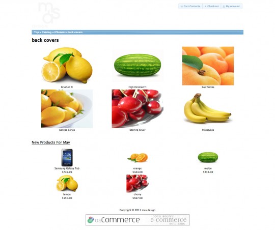
First thing we activate our template, the one we are working on, and now it looks like this
There is not really much to do here, things look almost ok. I’ll do following:
Disable the new products module. Very easy to do, in the file, at line about 88, comment out the new products module “inclusion” like this
<?php //include(DIR_WS_MODULES . FILENAME_NEW_PRODUCTS); ?>
Next, I will remove any borders and make the subcategory name to be placed on the image and not under it. The part of the file to work on is this here (line about 73)
echo ' <td align="center" class="smallText" width="' . $width . '" valign="top"><a href="' . tep_href_link(FILENAME_DEFAULT, $cPath_new) . '">' . tep_image(DIR_WS_IMAGES . $categories['categories_image'], $categories['categories_name'], SUBCATEGORY_IMAGE_WIDTH, SUBCATEGORY_IMAGE_HEIGHT) . '<br /></a><a href="' . tep_href_link(FILENAME_DEFAULT, $cPath_new) . '">' . $categories['categories_name'] . '</a></td>' . "\n";
What I will do is to place the contents of the <td> into 2 nested <div>, the first one will get the full <td> width and will be used to add a background, the second one will be positioned relative and will get the width of the image and will be used as a wrapper for the next element, an absolute positioned <p>, wrapped by the 2 div’s that will hold the category name
Final step is to adjust the subcategory image size, this I do in the administration panel under admin>configuration>images. Number of items per row can be set under admin>maximum values>Categories To List Per Row
The rest is a few lines of css to set margin and padding for the elements and to choose the background colors that will be again set as semi transparent rgba colors. I do also play a little with opacity values, so I can get a nice effect upon hover. For browsers that support transitions, there will be also a small delay in the effects
That’s how the site look like now
On hover over any subcategory, opacity values change and it look like this
Because I’m not sure yet about the image ratio that will be used, I created 2 more subcategory listing layouts, one with a dark background and one on a white background.
To switch from one listing layout to an other is quite simple, all that I needed to do is to change the number of “categories to list per row” under admin>configuration>maximum values and the subcategory image size of course under admin>configuration>images.
The colors can be set and changed by modifying a couple of lines in stylesheet.css
The final subcategory listing section of the index page, using the real product images look like this. The category name appear upon hover over the image
Index page: Product listing using bxGallery
The osCommerce product listing page (index,php for “case” products) looks by default like this.
After activating the template, we see that the “body” of the listing remain almost the same. How it comes? It has the css class “.ui-widget-content” and since we didn’t change the ui theme yet, the result looks same.
Before changing anything in colors and backgrounds, we want to change the way of product listing. The default osCommerce way is maybe suitable for stores with many products and very practical, since it gives a fast overview, but, in this case here, it doesn’t match the whole design.
How and where to change this? The file to work on is catalog/includes/modules/product_listing.php This one get included into the index.php file in “category_depth” products, at about line 238
include(DIR_WS_MODULES . FILENAME_PRODUCT_LISTING);
All data get collected in index.php, product_listing.php is responsible for the display. That mean that, if you want to have any other data displayed on your product listing, you need to make sure this data is taken from the database in index.php and then you can decide how to display it modifying this file here.
What we want to do is to change the listing style completely, to turn it into a “gallery” style. Since osCommerce has already the very nice bxGallery script (by Steven Wanderski) installed, there is no reason to look for an other one.
bxGallery must be applied to an html unordered list, so, first thing is to change the table structure of product_listing.php into an unordered list. (An “unordered list” is a list created by <ul><li> etc oposite to the “ordered list”, that means numbered, that is like <ol><li> etc)
After doing this, the file looks like this (in a simplified form)
 echo '<div id="liGal"><ul class="mainImage" >' . "\n";

    $pi_counter = 0;
    while ($listing = tep_db_fetch_array($listing_query)) {
    $pi_counter++;

            $pi_entry = '<li>';

	$pi_entry .= '<a href="' . tep_href_link(FILENAME_PRODUCT_INFO, ($cPath ? 'cPath=' . $cPath . '&' : '') . 'products_id=' . $listing['products_id']) . '">' . tep_image(DIR_WS_IMAGES . $listing['products_image'], $listing['products_name'] . '</a>';

            $pi_entry .= '</li>';

    } // end while ($listing = tep_db_fetch_array($listing_query)) {

    echo '</ul></div>';
To say the truth, all you need to do is, to look how it is done in product_info.php that use the same gallery. You can of course add anything you want into each <li></li>, in the example above it is just the image. I will add also the name, price, buttons etc, wrapping everything into <p> within the <li>.
If you want to keep the admin settings, about what to show on the listing, you can use the switch/case structure that exist in the file, just make sure you replace the table structure by <div>’s or anything that suit your needs
Do not forget to add this after your list is done
<script type="text/javascript">
$('#liGal ul').bxGallery({
  maxwidth: 375,
  maxheight: 375,
  thumbwidth: 185,
  thumbcontainer: 565,
  thumbplacement: 'left',
  opacity: .7,
  load_image: 'ext/jquery/bxGallery/spinner.gif'
});
</script>
You can find more information and setting options on the bxGallery site. However, hat are the settings I used to create a list like on the image below
All products of a category are listed in “thumbnails”, upon hover the main image on the left change. This is what the installed gallery script do
Upon hover over the main image, a short product description and the “buy now” and “details” buttons appear.
I’m not absolutely sure if I maybe prefer the large image to be on the right, that is easy to change by changing the thumbplacement: ‘right’, to be thumbplacement: ‘left’, in the bxSlider settings
Tell me what you like more, left or right? I really can not decide
An issue I had to solve here was that, the thumbnails generated by bxGallery are not links, they can not be clicked, or let’s say, if clicked they only change the main image. Here I did a temporary fix, I’m not posting it because it’s not very “elegant” and it also requires changes to the bx gallery script it self, so I think it will cause more questions than necessary.
Index page: product listing in a grid
Well, finally I decided to go with a much more simple and “lightweight” listing in a grid style, that looks like this
Things are much more easy here, than in the bx gallery case. All you have to do is, to modify the code of file includes/modules/product_listing.php to create a <td> for each product instead of a <tr> as per default. Within this <td> you can add any information you like, such as name, price etc. This I wrapped all into <p>, that are the <td> of the original file.
Next thing to do will be, to copy the “logic” of the products to display per row for example from the new products module, that is located in file catalog/includes/modules/new_products.php
In case you are a mini template system user, there are good news: This all and much more will be included into version 1.4 that will be released soon, so you can make all adjustments from your administration panel.
Index page: Front page with banners
We all know the default osCommerce frontpage, showing the new products and the famous”welcome guest” message
To show new products may be fine, depending on the store, but the “welcome message” is something that need’s to be removed in any case and for every price. People do not visit online stores to login or to create accounts, so, if you still have this on your store, remove it asap !
Having mini template system installed, it get really easy to configure the front page. Using the front page manager and the banner manager we can configure the front page very quickly without having to modify any file at all. (please note that mini template system is a commercial addon for osCommerce, do not click the link if you are not interested in anything that is not free and keep on reading here)
We are going to use the 2 banner modules, the first one to display a large image and message, the second one can be used to promote featured products or specials or anything. I won’t get to much busy with the content, since this is very easy to manage and change by the store owner himself.
That’s how our front page look like after a few clicks in the admin panel
Well, finally, the front page includes just 1 banner slider and look like this
This is however the easiest part of the whole design process, technically I mean. The hard part is to get the right inspiration :-)
As said, this is all done using mini template system. Let’s see what you would need to do in case you don’t use it. The file we need to work on is index.php and concrete the last “section” of it that starts at about line 244 in a default osCommerce installation and look like this
  } else { // default page
?>

<h1><?php echo HEADING_TITLE; ?></h1>

<div class="contentContainer">
  <div class="contentText">
    <?php echo tep_customer_greeting(); ?>
  </div>

<?php
    if (tep_not_null(TEXT_MAIN)) {
?>

  <div class="contentText">
    <?php echo TEXT_MAIN; ?>
  </div>

<?php
    }

    include(DIR_WS_MODULES . FILENAME_NEW_PRODUCTS);
    include(DIR_WS_MODULES . FILENAME_UPCOMING_PRODUCTS);
?>

</div>

<?php
  }
Here you can basically delete everything, so that this area of the file look like this
  } else { // default page
?>

<div class="contentContainer">
  <div class="contentText">

  </div>
</div>

<?php
  }
You are free now to add anything you want into here, this is plain html and you can do whatever you want, no limitation. If you want for example to add a slider, there are many nice jQuery based sliders around, I personally would use bxSlider as I did for mini template system. However, here is an other slider overview, but please do not feel limited to this, there are for sure more.
Most, if not all, of them will require to make an unordered list (<ul><li>) of the images you want to display. Some others allow also some text, however each slider has it’s own specific setup. What you need to do is to add the unordered list into the <div> structure left in index.php, link to each image separately and of course make sure the images are on the server and the path to them is correct.
Finally you will need to add the new script files and link to them in includes/template.top.php
If you want to have new products, or upcomming products or any other module you may have installed, you can add it to here like this for the new products
<?php include(DIR_WS_MODULES . FILENAME_NEW_PRODUCTS); ?>
If you want to style this module too, you need to do it in its file, for example the file that displays the new products is catalog/includes/modules/new_products.php
So, we are done with the front page, not so hard, not? Next step is no make the main navigation menu on top.
The header and the main navigation
This is something that I left for the end, for sure you noticed that on the final images, the header is already there. Here is how I did it
First of all to say that, even the main navigation is in the header, I didn’t modify the file that holds the header information at all ! Well, this is because of mini template system, if you have the default osCommerce, you will need to do a couple of changes to the file includes/header.php
The header section consist of 3 elements: The logo, the main “slogan” on the right and the menu under it
- The logo is easy, just upload it under admin>configuration>store logo. That’s all
- The slogan, at the top right is in real a banner. Instead of an image, I typed in my text into the “html” textarea in admin>tools>banner manager. I added this banner to banner group “my_theme_name_header”.The first row is a <h2> tag, the second one a <h3>. The rest is css styling
- To set up the menu, I created a link group using mini template systems link manager and enabled the main navigation bar setting it to display my just created link group.
That was all. Lets see now what I had to do if not using mini template system. Here is a useful article to read, that explain the osCommerce header structure. If you want such a header, what you need to do in file catalog/includes/header.php is
- replace the contents of <div id=”headerShortcuts”> by the banner code. You will find such a code example in file catalog/includes/footer.php Choose a link group name and add the content to that group via admin, same as I did before
- Strip out the complete breadcrumb section and replace it by your menu. I’m sorry, but I can’t go into details here about how to create such a menu, maybe there is something in the osCommerce addons area, I’m not sure. As a general orientation, you need to get your categories structure into an unordered list (there is an addon for this) and then apply a script to create the dropdowns, what I use is superfish, but there are others too.
Additional information
I used a custom ui widget theme to fit the needs of the template. This I created using themeroller, all I had to do was to install it, you can read here about how to install a new theme to your osCommerce store
I used also custom fonts for the header section and all page headings, you can read here about how to do this
Well, people, I maybe forgot to mention some things I did, feel free to ask. I’m sorry for not going into detail in some things, the post would be too long, it is already long, I’ll try to cover particular issues in separate posts. Target of this post is finally to give you inspiration and not to teach you each technique step by step
Conclusion
Files that I had to modify (starting from a default osCommerce 2.3.1 store and without mini template system in use) are
- stylesheet.css
- index.php
- product_info.php
- includes/template_top.php
- includes/header.php
- includes/footer.php
- includes/modules/product_listing.php
Total = 7 files.
Please realize that changing just 7 files changed the overall look of the store completely. Consider this when you are planning to purchase a template and ask (before buying) how many files will need to be modified or replaced by he template. Most of the poorly coded templates will require a complete reinstallation of osCommerce. A properly coded template will not require changes to more than 10 files, something aroud 5 to 10 files. Also to say that, if using mini template system most of the files don’t need to be modified at all.
The store is live and you can visit it if you like here Mas Design Feel free to browse around and to check whatever I posted here. Please do not make any test orders because the store is live, I guess that real orders are welcome of course, I can only say that this titatium backcovers are really a nice thing.
Enjoy
PS Please do not ask me to send you this template. I’m not selling it and not giving it in any form. This is a custom work, the design and layout are unique, the store owner participated him self at many stages of the design process, making images, suggestions, giving ideas etc. So, there will be no second exactly same store. If you need a custom store, you can get in touch of course, I’ll be happy to discuss any details with you, but please don’t ask for exactly this one





I think the new design is fab, I love the darker look of sites. I am still a little confused where you create a template and how it is uploaded into the mini template system – perhaps others will also be vague on this, could you perhaps expand that section a little when you have a moment.
I cant wait for the next installment.
I think the large image at the left looks more pleasing to my eye. Its looking very smart.
Wow! It’s amazing watching how simple it *can* be to change a default osCommerce installation. What you have done so far looks really, really good! I prefer the image on the right as it feels more natural to go that way to click add to cart or checkout etc…
Hi People, Liz and Matt, thank you for the comments.
The process stoped for a while since I’m waiting for the clients images, but I hope to get them in the next days, so I can proceed
I love this tutorial, but striking out on some of the details.
Could you provide a little more description?
It looks awesome!!
Great work
Was wondering about the hover effect for the subcategories. Itll be awesome if I can get more detail on it.
But the site looks awesome.
@Edde, thank you for the comment.
I’ll try to post more details about this and that n separate posts, need to find some time first.
What you need to do basically is:
- Wrap each subcategory “box” into a relative positioned < div>
- Wrap the info you want to appear upon hover into a nested and absolute positioned < div>
- Adjust the behavior of that nested div via css. There are 2 “states”, the regular, where the div is not visible and the hover where it should appear. You can use for this rules like opacity, negative bottom, transitions etc
having problems with product_listing.php can’t turn it into a “gallery” with bxGallery script, I need more information about how you did that; please
Hi Viorel
Well, the purpose of this article is to give a general overview of a template design process and to show the possibilities that exist in osCommerce.
Going into each detail, would be too much I think, I will try however to cover different parts in future posts
As a sidenote, I gave the “bx gallery listing” idea up for a while because of different reasons, I’ll go after it again, eiher by using bx gallery or an other script, after the basic mini template system module for product listing will be out
What good is a tutorial using a commercial product as a basis?
Anything shown in this tutorial can be done with or without mini template system
Things are easier if using the template system, but the post does not focus on that. It explains how to do things without any other tools but a plain text editor.
Very good tutorial. Nice sharing. Thank you.
Very Nice Tutorial. I appreciate you sharing your knowledge with us. Keep up the good work and I will be back to see the finished store.
Nice, this looks very smart!
Hi there, I discovered your web site by the use of Google even as searching for a related subject,
your web site got here up, it appears to be like great.
I have bookmarked it in my google bookmarks.
awesome tutorial, the only thing i really got confused on was making the front page a slide show of banners i’ve made and will make more. could you go into a little more detail on that or give another link that explains it better I tried both using the banner code from footer.php to put into header.php and tried to use the sliderbox you first listed but i don’t know where to put what code where. Sorry to trouble you but if you have time i would really like to know esp now that i’ve messed my site up trying to do it. :( I understand you probably don’t want to do every step on that but perhaps a few pointers where js goes, html goes and the css which i assumed just went in the style sheet so don’t think that’s a problem. The js and html links and what to name it i don’t know and i can’t get to my backend right now, when i installed the custom tshirt module it kicked me out or timed out and won’t let me sign in, if anybody knows the solution to that I’d appreciate that as well so i don’t have to spend hours on google reading to find it like usual because i don’t know where to look, a link on that would be more than sufficient on the last part. Anyway thanks for the tutorial my site was looking pretty good i think, little different than his but that’s the point i think is different but still a good custom design to show off my clients tshirt shop. awesome Job!
This must be the best and nicest tutorial for OSC i’ve found so far…
Does this tut still counts/works for OSC 2.3.3?
I’m new and learning so I desided to go through this tut and rebuild this site only for practicing but I didn’t get to far till now.
changing the footer by adding the code makes everything in the footer dissapear, but you still have the placeholderlinks there?
And the header is also giving me a header-ake ;-)
for the background I had to put in the full path before image gets displayed.
cause of these things my question above…OSC2.3.3
thx
grts
thumbs up
Hello Youri
Yes, the post above is valid for osCommerce 2.3.3 too of course, there are no differences to the version the store was originally build on
To your questions and issues: I suggest to get in touch via email and give me some more details about what you want to achieve and what you tried to do so far
Dear George,
I like all your tutorials, they are easy to understand and to follow, especially for newbie like me.
Please also make tutorial on the header tags subject such as adding page tittle, keywords, etc to improve seo
thanks
Great tutorials. thanks. On the product information page, if i like to move the product images area under the description ( not on the right or left) and i need a small space (maybe 2-3 px ) between the additional images (thumbnails).
please let me know how should i do. thanks
Great stuff. However I wonder if it’s possible with a shop that have 30 categories, 250 subcategories and more than 5000 products.
Of course it’s possible
I have to say however that, this particular design not the best is, for a store with many categories and products, you would need an easier navigation for this, depending on the category structure
That is why any design has to start at the same point: the content ! It is impossible to setup any effective design without having a good portion of the content in place and a concrete plan about how things will be
This is finally the meaning of a custom design: To fit the design on the store’s content, not the opposite, to press the content into some template
This is interesting template system for oscommerce, but is there any performance hit after installing the template system?
I have been a power user of OSC for many years. I have just about hacked on every OSC file and there is a bunch of em…. Performance was always satisfactory after a few optimization tricks learned along the way. Average store loads were 900+ cats and 20,000 or so pIDs.
Recently, I had the need for a very heavy duty cart. Research and curiousity found me diggin thru the MTS files and I seen an awful lot of code and time spent writing it.
I tested a stock MTS package, by loading up 8414 categories and 181,811 products. I have run every speed test, query test, and error checker known to me. This baby is hummin right along and the ultimate test is when it goes live and the orders start streaming in very soon.
THANK YOU MULTIMIXER!!! Your work ROCKS!
Hi George,
MTS is running strong. Here is some specs on couple of my tables:
My products table = [Showing rows 0 - 29 (181849 total, Query took 0.0028 sec)]
My categories table = [Showing rows 0 - 29 (8414 total, Query took 0.0014 sec)]
Chrome tools is showing a 500ms to 700ms load time with the caches primed.
Mini-Template-System is serving up those pages and set to “TRUE” !!
The only other hack is that I have moved all images, .js files and .css files to my cookie-free-domain located on a different server. I have a lot of images to manage!
Running FWR’s error checker module and I get ZERO errors or php warnings.
Going live soon! A few more days of coding left and I will release this beast.
Thanks again!
Smiling Ron :-)
Hello I’m trying to get the bxslider vertical I’m not sure how to do it when I use mode: vertical in the following code it doesn’t display properly, its way too big images.
$(‘#piGal ul’).bxGallery({
maxwidth: 300,
mode: vertical,
maxheight: 200,
minSlides: 3,
slideWidth: 200,
thumbwidth: 1) ? ’65′ : ’0′); ?>,
thumbcontainer: 300,
load_image: ‘ext/jquery/bxGallery/spinner.gif’
});
Can you please give example of code to get vertical bxslider on product info page. any pages and code involved please list. I did check bxslider website and can’t find anythign other than mode: vertical but it doesn’t say where to insert and there is no vertical example.
bxGallery has nothing to do with any sliding, for this you can use the bxslider script.
The code you are trying to edit refer to bxGallery, so I doubt you’ll get any sliding effect
Hmm I was able to figure out the above issue using CSS, but now I’m in a big jam following your tutorial. I don’t understand how to code the product_listing page. If you could either epxlain code or just send me (or post) the entire code for that page I would appreciate it. I tried following the product_info page but I’m totally lost. I tried copy and paste of your code but didn’t know where to place it in the page and had nothing but errors. The problem is there is no longer a link to the bxgallery script. Thanks in advance
The meaning of my post is to show some design options and to give maybe some inspiration, It is not a copy-paste instruction.
I’m sorry, but I can’t send you any code
I would suggest to look at the add ons section of osCommerce, there are a couple of add ons that will get you on the way.
Okay, I figured out how to get the bxGallery working (took me 2 weeks) now I just need to know where to insert the javaScript and tags for the product listing page? There is no head section for me to do this in product_listing.php
There is a topic on the osCommerce forum where people are helping you already: http://forums.oscommerce.com/topic/396268-product-listingphp-header-tags/
In general, the
section is in file catalog/includes/template_top.phpOkay Multimixer, thank you for all your help I figured it all out now only one problem remains. How do I get rid of the excess blank space under my main image on new product listing page? I can’t make my image bigger or it pushed the thumnails to next line but there is alot of blank spaice under main image
How to get captions on thumbnail images? I have captions on large image but don’t know how to get captions for thumb images. thank
Not sure what thumbnails you refer to?
the thumbnail from product info page you have main image and then thumb image I want to add caption with product name like you have in tutorial many thanks for my help
I didn’t try this, I’ll update the post when I have the time
Hi! thanks for the info you post, I want to ask you something, In the page for my products I have the products and below are the thumbnail, but these images appear to close together, Do you know where is the file that I have to edit. Here is the code for the page that I want to change, I want to add a padding-right to each small images which are in the :
$(‘#piGal ul’).bxGallery({
maxwidth: 300,
maxheight: 400,
thumbwidth: 50,
thumbcontainer: 300,
load_image: ‘ext/jquery/bxGallery/spinner.gif’
});
$(“#piGal a[rel^='fancybox']“).fancybox({
cyclic: true
});
I hope you have an idea :), thanks!! Saludos,
@Marta
You can do this via css as follows
#piGal .thumbs img{margin:5px}
or you can add a border
#piGal .thumbs img{border:2px solid #fff}
In product info.php you need to adjust the “thumb width” and reduce it by any margin or border width you sett in the css x2.
Eg, if thumbwith is 50 and you set a margin of 5px, then you need to set thumbwidth to 40
Hello. I have been working on my header and footer. I wanted to add a horizontal line on the header that stretches full screen. I added a .fixcenter on the stylesheet to make the body content stay centered but I can’t seem to match the header hr to do the same as the footer.
A screenschot can be seen here.
https://www.dropbox.com/s/sqy9x219isn2vbx/fixcenter.png?dl=0
I only messed with header, footer and stylesheet files.
Please help. Thank You
Hello
It is not possible to give any useful advice that way, there is much more information needed.
Either get in touch by email or post your issue to the osCommerce forum
Thank You for taking the time to respond quickly.
My question is, How do I change the header size to 1366 and keep the body content at 960 still centered without messing up how the columns/grid display on the body? (I didn’t want to mess with the ext/960 css so I mainly tried to manipulate it with the header, footer and main stylesheet file)
I was able to add a dotted hr on both the header and the footer just how I wanted it but then it affected the body content shifting it to the left, no longer centered, and the column right goes down below the main content.
Hello. I failed to add positioning on the main style sheet and doing so solved my problem without tampering with any other files other than the 3 I mentioned earlier.
I just want to thank you for this site. It is definitely a glimmer of hope especially those who just want to pull their hair out of frustration.
Hi there! This is my first comment here so I just wanted to give a quick shout out and say I genuinely enjoy reading through your articles.
Can you recommend any other blogs/websites/forums that deal
with the same topics? Many thanks!