Styling the modules on the product information page in osCommerce
multimixer | learn | Wednesday July 27 2011The product information page in osCommerce displays usually, beside the product information it self, various modules: For example the “also purchased” module, or “related products” in case you have that, or “slave products” and various others.
All of that modules have a common css styling: The ui widget styling. The module heading is class “ui-widget_header” the content is “ui-widget-content”. That’s all fine and can be styled very nicely using themeroller and you can read here about how to change the ui theme of your store easily. But what is in case you have more than one module on the same page? Does it not start to look a little boring?
If you like to change the look of one – or all – the modules on your product information page, keep on reading, it’s really very simple. We are going tho change the look of the “also purchased” module, that is the most common, since it exist in each store by default
That is how the module look like on an unmodified store
Applying and other ui-theme, it looks already much different
Please note that the image above shows a store designed with mini template system, other design changes you see in relation to the default set up are because of that. The ui theme will change the colors of your module, not more
So, what to do to change the look of that module?
First lets go to apply a unique id to the whole module, so we can be sure that any setting we do will affect just this and not anything else too.
The file we need is catalog/includes/modules/also_purchased_products.php. All we do here is to add one id to the wrapping div as follows
Change this
<div class="ui-widget infoBoxContainer">
to this
<div id="alsoPurchased" class="ui-widget infoBoxContainer">
You can close and upload the file.
Anything else we do in file catalog/stylesheet.css (for mini template system users the file is catalog/mts/themes/theme_base_001/style_custom.css)
Here is some css that I used
#alsoPurchased .ui-widget-content{ border:1px solid #7ba6d3; padding-top:30px;  -moz-border-radius:3px; -webkit-border-radius:3px; border-radius:3px;}
#alsoPurchased .ui-widget-header{border:none; background:none; margin:0; font-size:14px; font-weight:normal; position:relative; bottom:-10px;}
#alsoPurchased .ui-widget-header span{color:#fff; background:#7ba6d3; padding:10px; border:1px solid #7ba6d3;  -moz-border-radius:10px 3px 3px 0; -webkit-border-radius:3px; border-radius:3px;}
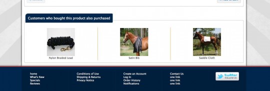
And that is how the result look like
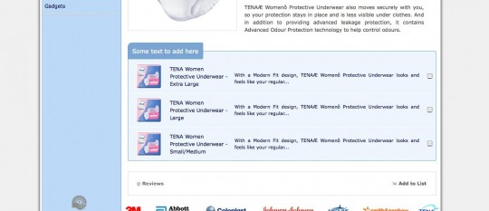
The orange separation lines can also be added easily. And of course you can change the css settings completely as you like Here is an other example of styling the “master slave” listing module that I added to an other site
Now go on and make your store a little more pretty
Enjoy


Hi,
Thanks for the great article! Any tips on the dividers between the images? It looks really cool. Thanks,
Matt
Hi Matt
That is easy to do. Just add a left border to the td’s within the #alsoPurchased and then make sure that the first one get its border removed again
PS Nice chocolates you have :)
Hi,
Thank you very much! All the time working on my site and I have never used this before. This is what I used-
#alsoPurchased td:first-child {border:none;}
It appears to be working but from what I’ve read, IE has issues with it (what a surprise!) but I am not too worried about it. Thanks for checking out my site, I have put a lot of time into it and Gary has also helped bail me out several times when I got stuck with more “in depth” programming lol Our chocolates are really good (I make them all by hand) but it’s too bad you live in Greece ( I think that’s what I saw on the osC forum)….they might melt before you got them!
Yes, I see, you did it really nice.
In case you have more rows, you could make sure it pics the first td of each row like this
#alsoPurchased tr td:first-child {border:none;}
Right now it pick only the first td (top left in case of more rows)
Maybe you want to move the new heading section a bit to the left? I guess a left:-10px will do it, the class is the ui-widget-header of cource
IE has no problems with :first-child from version 7 and upwards ( IE compatibility chart ), not the same for :last-child that can be used only for version 9 (= not yet for really browser compatible production sites)
Yes, I’m in Greece, too bad, no chocolates for me …
Hi,
Thanks again. I took your suggestion and it looks better than what I was thinking looked good previously. border-radius:10px 3px 3px 0; is a nice touch as well.
Hi, is it possible to use BxGallery in order to modify the look of the modules?????
Hi Kostas
I don’t know exactly what you mean with using bxgallery to modify the look of the modules.
If your target is to display the contents of the product info modules as a slider using bxgallery, then yes, that is possible to do of course
You would need to alter the module file it self (eg catalog/includes/modules/also_purchased_products.php) and change the output to be an unordered list on what you can apply the bx script then
That’s a good idea, I will include this into mini template system in one of the next upgrades
Thanks for this info, I have made my site a little better than standard, your instrustions are very easy to follow for us new starters with this program, I just need to add extra info boxes, Have you could a easy how to do it link?
Happy new year
Hi Katt, happy new year
It’s not very clear what you need exactly, do you need extra info boxes for the left/right columns or do you need additional modules for the product information page?
In both cases, what are the infoboxes supposed to display?