Equal height for osCommerce product listing boxes
multimixer | learn | Friday March 18 2011I started recently to work on a cross/up sell feature. So, I created a new module that is showing cross sell and/or up sell items on the product information page in osCommerce. The whole thing is based on the existing related products addon, that I had to modify of course to make it compatible with version 2.3.1.
What I’ve got is a box that display for each cross or up sell product it’s name, model, manufacturer, it’s image, part of the product description, price and quantity and the buttons “buy now” and “details”.
I won’t go into more details about this, the topic here is an other, it’s about the old and well known problem about how to get an equal height for each box.
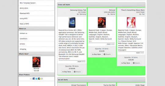
Here is an image of the problem. The background in in green on purpose to make the problem clear
You see that each product column has it’s own height and that doesn’t look nice at all. Even I’m using an example here for the product information page, you will face the same if you want to do similar listings for the index page or the new and specials modules.
What to do now?
To understand the following comments lets take a look on how this box is structured in a simplified form (I will leave out anything that is not related to the issue. The complete and real code will be available at the osCommerce addons soon anyway)
<div class="outer">

  <div class="inner">
    <div class="heading">
      <p>name</p>
      <p>model</p>
      <p>manufacturer</p>
    </div>

    The image

    <p class="description">description</p>

    <div class="buttons">
      <p>quantity</p>
      <p>price</p>
      <p>buttons</p>
    </div>
  </div>

  <div class="inner">
    <div class="heading">
      <p>name</p>
      <p>model</p>
      <p>manufacturer</p>
    </div>

    The image

    <p class="description">description</p>

    <div class="buttons">
      <p>quantity</p>
      <p>price</p>
      <p>buttons</p>
    </div>
  </div>

  <div class="inner">
    <div class="heading">
      <p>name</p>
      <p>model</p>
      <p>manufacturer</p>
    </div>

    The image

    <p class="description">description</p>

    <div class="buttons">
      <p>quantity</p>
      <p>price</p>
      <p>buttons</p>
    </div>
  </div>

</div>
1) Limit the number of characters used for the description
Yes, this is done already. But even we set eg just 300 characters to be displayed, there is maybe a product with just 100 in it’s description. So we can set the limit to 100. But do we really want to limit all product descriptions, just because one of them has a short or no description?
So, that’s not a satisfying solution, at least not completelly
2) Set a fixed height for the description.
That is exactly what I was doing till now, to add to my stylesheet.css a fixed height for the element that containns the product description like this:
.description {
  height:200px;
  min-height:200px;
}
A side note: If you are copy pasting anything here, please be careful and use your own names for the css classes, or add an id to the whole container. It can be that the same names are used elsewhere in your site and this could cause problems
But again, is this solution a good one? I say no, or at least not 100%. I don’t like the idea that each time I want to change the length of my description I have to modify several files to make it look ok again
3) Faux columns
This is a well known technique, that can be realized in 2 ways: The one way is using background images (you can read here about faux columns in osCommerce) the other way is to faux using css. Second solution I do use for example for the side columns of osCommerce
Do this solutions solve our problem? again, no. The image solution requires a fixed width, and we don’t know how many boxes there will be per row, the content is dynamic and can change any time.
What comes next? A google search and one more solution based on css
4) The css way
Here is the article I found that explain how to get equal height using css only. Please take a look and then come back here.
Sounds great not? But again, we can not predict how many products we will have per row. So we don’t know exactly what classes to apply to where. Trying to create some logic to make all those percentage calculations, I really got a headache. Conclusion: This solution sounds good for a static html layout, but is not good for our purpose
Back again to google. This time some more solutions based on jQuery. From all results, I took 2 to try them out
5) The jQuery way 1
This solution, to set equal heights with jQuery comes from the same people who also did the themeroller that we all use in osCommerce 2.3.1. Very promising, so lets try it out.
First, we copy the script into a .js file and upload that file to the server. Lets say we call the file equalheight.js. You can place it into folder catalog/ext/jquery/ of your osCommerce installation
Second, we link to that file. In file catalog/includes/template_top.php add just before the closing </head> following line
<script type="text/javascript" src="ext/jquery/equalheight.js"></script>
Then, we go to the file we create the listing. This could be the file catalog/includes/modules/product_listing.php if you do something for the index page, or catalog/includes/new_pproducts.php if you alter the new products module, or whatever. Here we are going to use the simplified example posted above
We need to apply a css class or id to the outer element that contains the columns of our product listings, like this
<div class="outer equalHeight">

  <div class="inner">
    <div class="heading">
      <p>name</p>
      <p>model</p>
      <p>manufacturer</p>
    </div>

    The image

    <p class="description">description</p>

    <div class="buttons">
      <p>quantity</p>
      <p>price</p>
      <p>buttons</p>
    </div>
  </div>

  <div class="inner">
    ......
  </div>

  <div class="inner">
    ......
  </div>

</div>
Last step is to call the script in following way
$('.equalHeight').equalHeights();
The script will apply the height f the tallest direct child to all other direct children (in our example the div with class=”inner”).
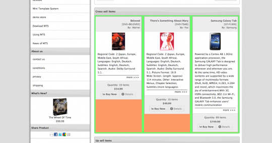
The result look like this (the equal height area is marked orange
So, ok, we come closer. We see that the buttons section is not at the bottom, closest thought is to position it absolute into it’s relative positioned “inner” conteiner.
Our css look like this
.inner {
  float:left;
  position:relative;
}
.buttons {
  position:absolute;
  bottom:0px;
}
Again, copy pasters, please be careful with the class names, choose your own. Also, only the css related to the issue is shown here
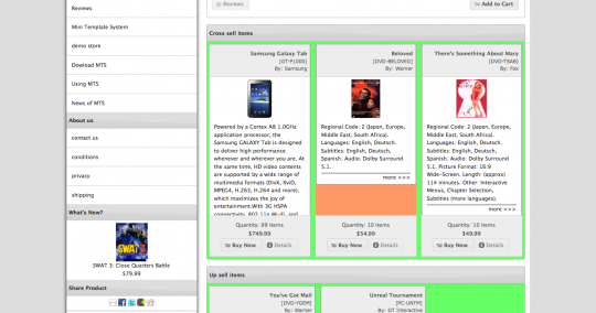
And the result look like this
What is now? The buttons section covers part of the description of the tallest element. Again a solution to this, to add some bottom margin to the description, that need to be equal to the height of the button section.
So, lets go, but… wait: Do we know this height? No we don’t because if depends on the content of the buttons area, and there can be a price or not, a quantity or not, the buttons themselves or not, according to the administration settings
Conclusion: We came very close, but that’s also not exactly what we need.
Back to the google results. But first lets think again what our problem is: We have a description that is not equal in length for all items and we want to make the container (in our case the <p class=”description”> to have the same height. In other words: We need something to apply to the inner element (the description) directly.
Is there something? Yes there is !
6) The jQuery way 2
This solution about divs of equal height using jQuery script has one main difference to the previous. It apply to the inner element, and that’s exactly what we need
The procedure is the same as at point (5): Paste the script into a file, link to the file.
Then in the file we are working on we add a class to our <p> that contains the description as follows:
<div class="outer">

  <div class="inner">
    <div class="heading">
      <p>name</p>
      <p>model</p>
      <p>manufacturer</p>
    </div>

    The image

    <p class="description equalDesc">description</p>

    <div class="buttons">
      <p>quantity</p>
      <p>price</p>
      <p>buttons</p>
    </div>
  </div>

  <div class="inner">
    .....
  </div>

  <div class="inner">
    .....
  </div>

</div>
Finally, we call the script in the same way as before, only difference the class name and the script name
$(".equalDesc").setEqualHeight()
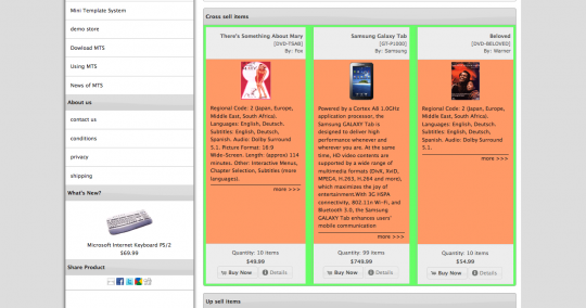
and how does everything look like? (The description is now in orange)
Yes, that is it ! That’s the way to go. One more last image without the help colors
Try it out and enjoy
I will try it out for the columns left and right now


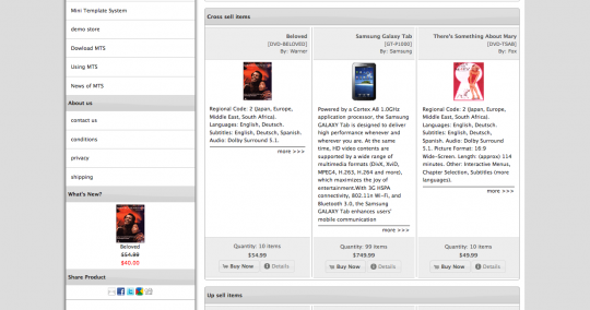


I don’t like the gaps underneath the “more>>>” link. Why not do this;
Move the more>>> link into the div.buttons. On the p.description, give this a height, min-height and hidden overflow. Now the boxes are all the same, and no gaps.
Hi Gary
The more>>> link can move to anywhere, it can also be taken out because of the “details” button.
About giving a height to p.description, that is what I was doing all the time till now, but I was looking for a solution to have an equal height without a fixed css setting
With this jQuery script you can get also an equal height per row, if you include a row counter into the p class, so it adjust to the tallest element of each row
It looks awful though :(
Gary, do you want me to take new screenshot without it? lol
There will be admin setting for everything, so each store owner can do as per his taste
Haha :)
I guess I don’t like uneven things, even if the fact they are uneven is because they are even (if that makes sense).
I can only say most developers present their expertise in some high level technical way – forgetting the potential reader is most likely not a developer…In my book you are the best and I recommend you put your work in a book since I am convinced it will be a best seller.
Many thanks for taking the time to share what you know in the public space.
I am a copy / paster because at this point in time I am researching understand better.
Please keep up your good work.